project 04
Trail Mix
TrailMix was developed as the final project for a senior interface course, where our task was to design a mobile app and create a functional prototype for any user base, that connected to and communicated with a database or API. This was a seven week project involving ideation, user research, interface design, interactive prototyping, user testing, and refining, where we created our final app concept of TrailMix; a hiking platform for learning, planning, and navigation, designed to inspire novice and intermediate outdoor enthusiasts.
Tools
Figma, Framer, Mapbox API, Adobe Illustrator & Photoshop, HTML, CSS
My Role
UI Design, User Research, Persona Development, Prototyping, Web Design
TrailMix product webpage deliverable:
Scenario
Early on in our project ideation, we recognized that there currently already exist many apps that provide trail suggestions, trail info, maps, etc., in addition to others for planning hiking trips. However, we noticed these apps lacked in their ability to provide helpful navigation without cell service and didn’t provide adequate planning capabilities with friends. We wanted to take a deeper look into these problems and how we could provide people with a way to stay safe out on the trail.
Ideation
The first step of this project involved defining a user domain to work within. We chose the domain of young adults living in Vancouver, particularly novice and intermediate outdoor adventurers who want to travel and explore their local surroundings safely. From here we established 3 initial app ideas, where our final product became an amalgamation of bits and pieces from each idea concept.

User Research
We continued refining our initial ideas to further cater to user needs within our proposed domain, so we went on to conduct research with users in our target domain to learn more about what was currently lacking from current outdoor trail applications that they were using. Based on our research of 18 participants we found that users wished there was a way to view maps offline without having to remember to download them prior to a hike, and a way to provide novice hikers with wayfinding tips and visual cues to look out for on a trail in order to gain insight about a trail before embarking.
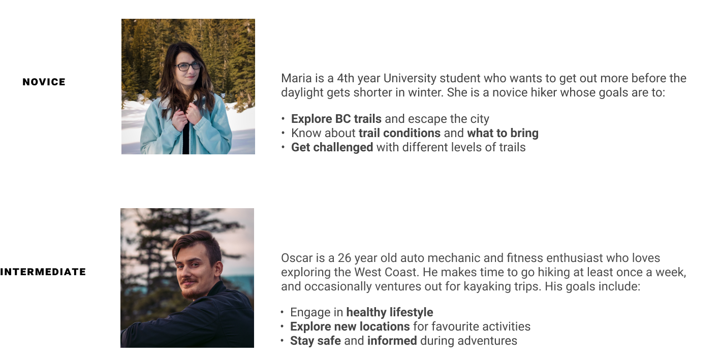
Demographic
Young adults (19 - 32 y.o)
Novice and intermediate adventurers in BC
Frequent and occasional hikers
Common User Goals
Want to have local travel options with varying levels of difficulty to accommodate experience
Want to safely and confidently explore new and unfamiliar parks
To best represent our demographic, we created personas of target users with relevant goals, which we used to guide our use case scenarios.
App Concept Sketches
Low fidelity wireframes sketched by myself and one of my teammates, of our initial ideation of potential mobile layouts and user interfaces where we began to further explore the organization of content we intended to include.
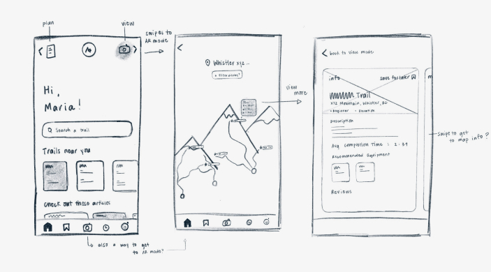
At this stage we still planned to implement AR functionality but we quickly found that this would be out of the scope and timeline of this project. Thus, this is where we started to pivot more towards a learning, planning, and trail discovery platform.
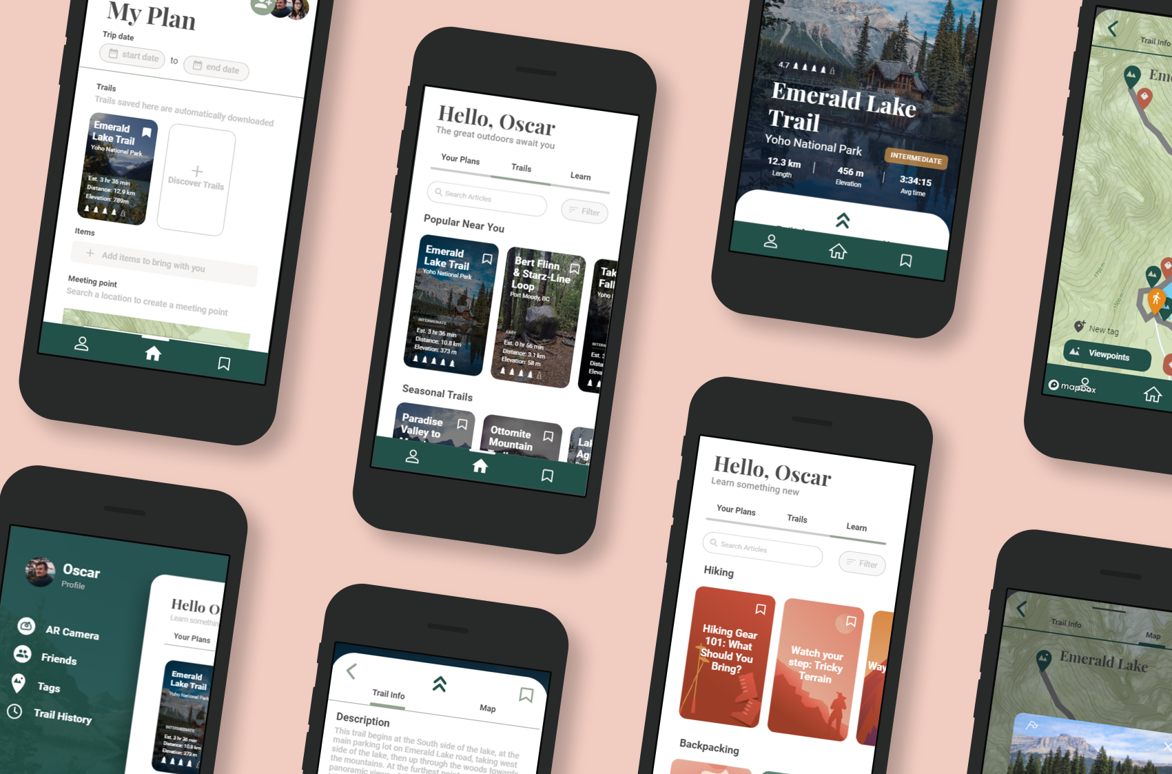
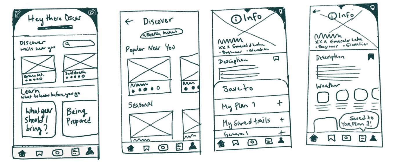
Wireframes
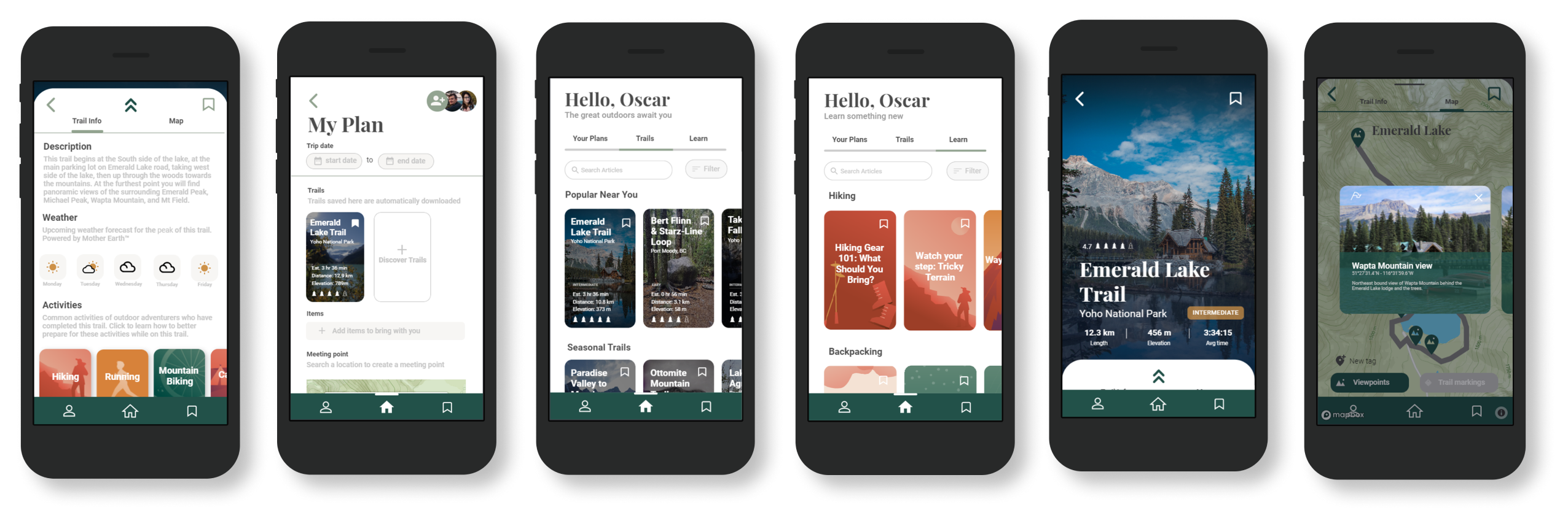
Since our focus began shifting away from AR, in this stage of the design process we moved towards a simpler bottom nav menu because we found that our low fidelity sketched menus looked too cluttered, so we reduced the navigation bar's complexity for better usability.
Early home screen with old nav bar
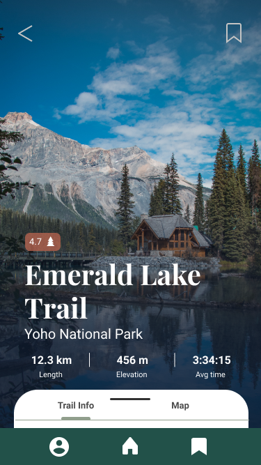
Initial trail landing page from card
Swiped up trail card description card
Trail marker view variation
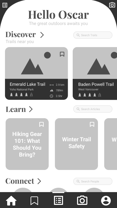
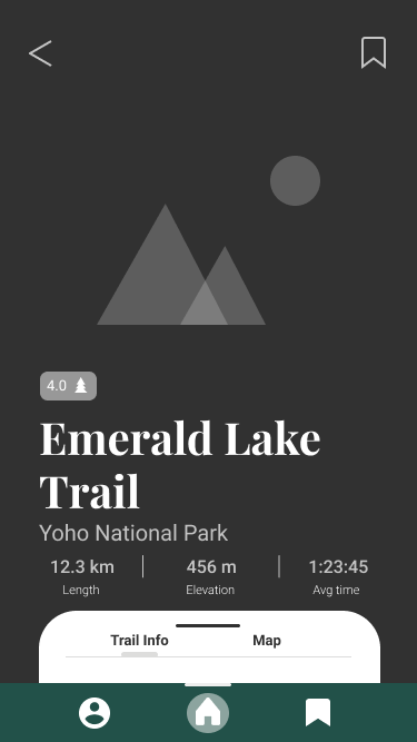
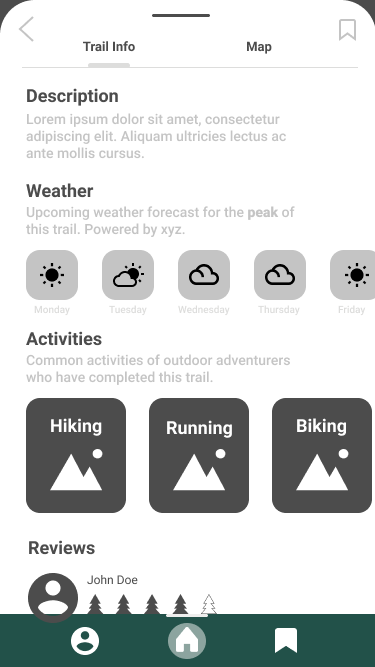
Initial UI
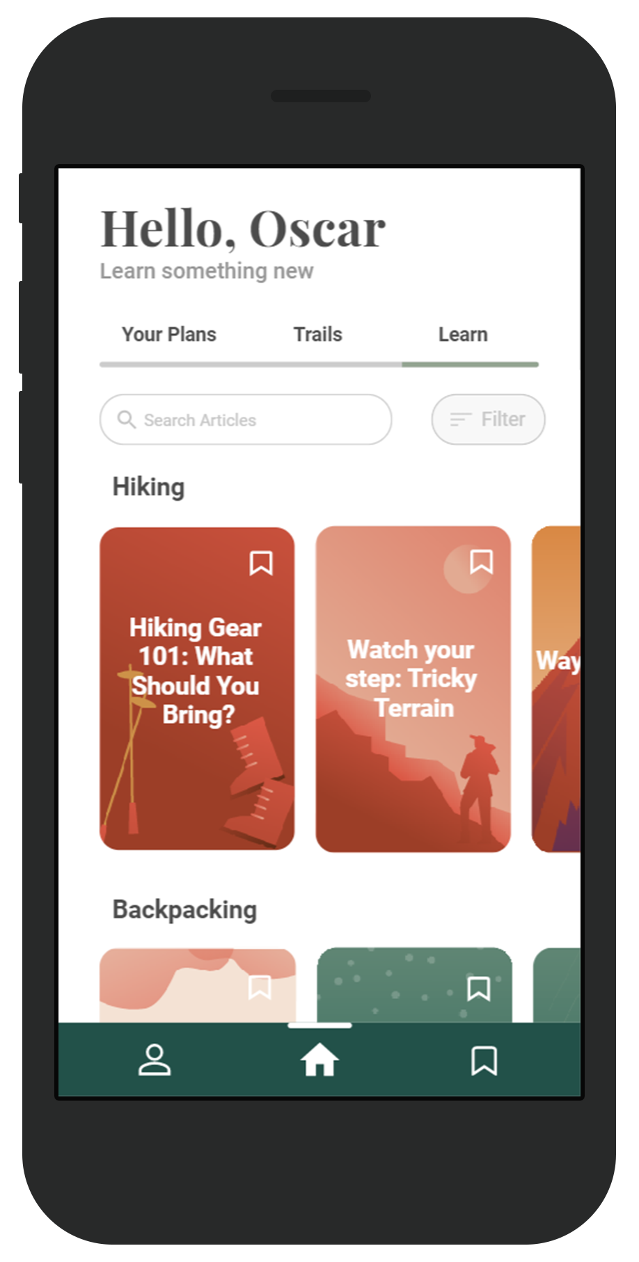
We then began finalizing our TrailMix branding, styleguides, and colour palette in order to focus on the visual design of our original interface.
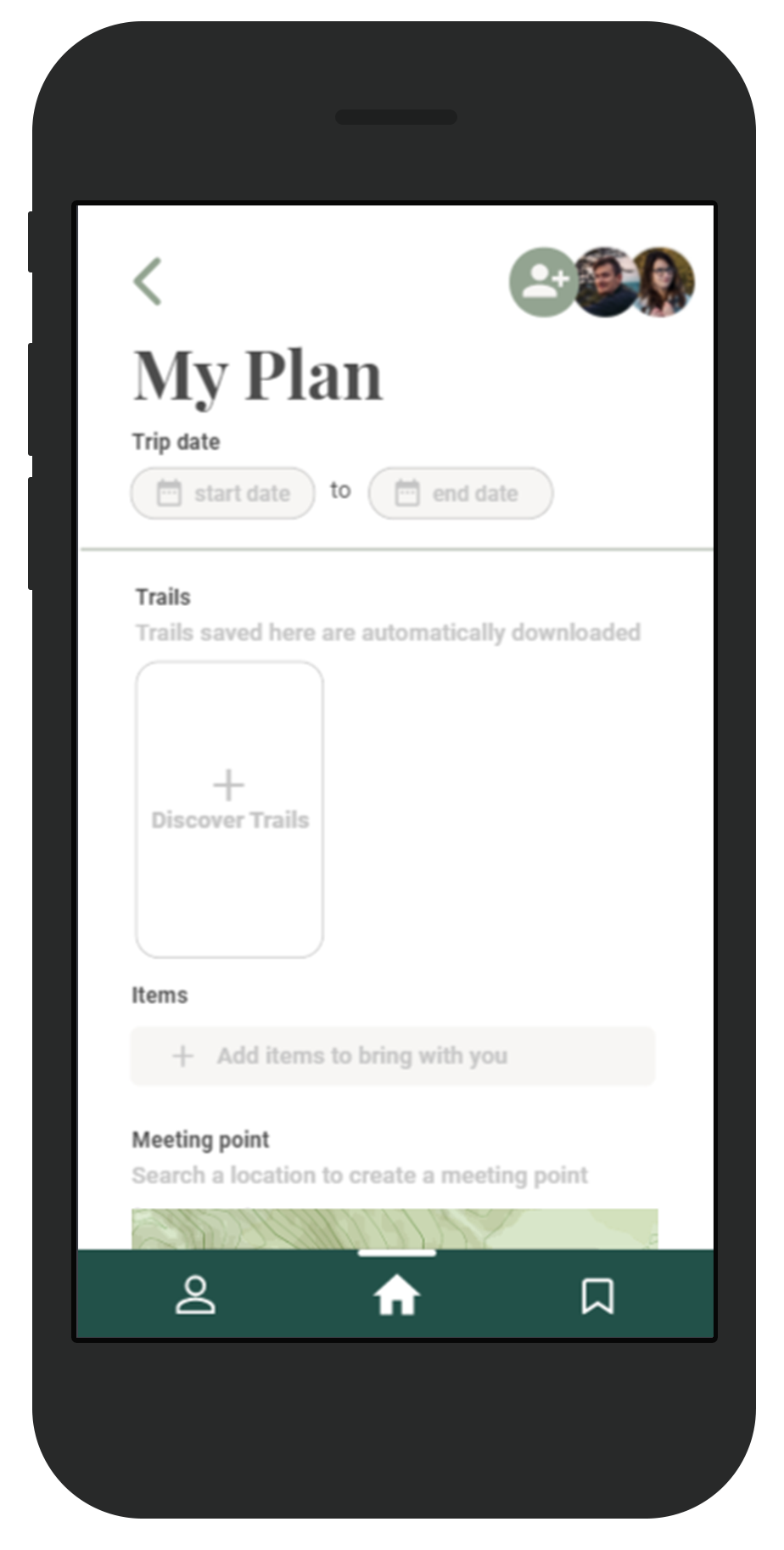
Planning page template
Original prototyped homepage
Initial trail title card
Swiped up trail card description card
Interaction Design & Prototyping
During our prototyping stage we further established interaction patterns, focusing on tapping and swiping to create a consistent and clear experience. Once we developed our first prototype iteration, we then went on to test with live users to further refine our app.
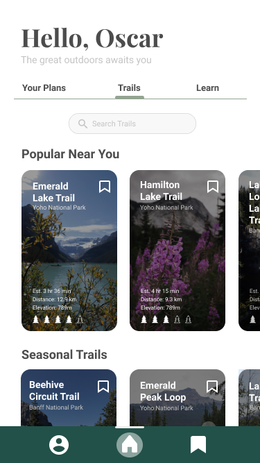
User flow for discovering a trail
Learning about what to bring on a hike
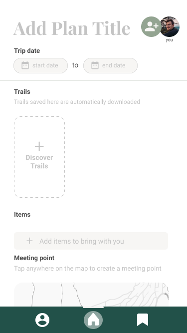
Creating a new plan with a friend
User Testing
We tested our prototype using Zoom and through in-person testing. In-person testing of the navigation tools allowed us to view live observations of interface navigation out on the trail. Participants observed through Zoom video were asked to interact with the prototype on their phone and to talk aloud about their experience when creating a plan and interacting with navigation tools in a pre-hike scenario.
In person testing insights
User felt excited about finding the mapped viewpoints and trail markers and despite the lack of real GPS tracking, the user was able to identify the trail marking tag on the map to take to stay on the path
Was confused and unsure of where the trail start was on the map
Occasionally lost track of which trail tags user had already passed, due to lack of real-time GPS tracking
Remote/Zoom testing insights
Users enjoyed exploring the map as well as the ability to add items from an article list
Users didn't know the trees meant trail rating and instead thought it indicated trail difficulty
Users didn't know to swipe up on trail tab - most tried tapping
Prototype Refining
After conducting our usability tests, we performed a basic heuristic analysis, categorizing identified issues into major, minor, and cosmetic issues and prioritized them accordingly. Using this structure and with insight from our user testing, we began implementing fixes to bigger issues such as the addition of a drop shadow to ensure buttons and labels are more visible and rearranging of content on the trail title card to create a clearer hierarchy of information as seen below.
Addition of interactive meeting point for prototype - ability to select trail
Ability to edit items in a list
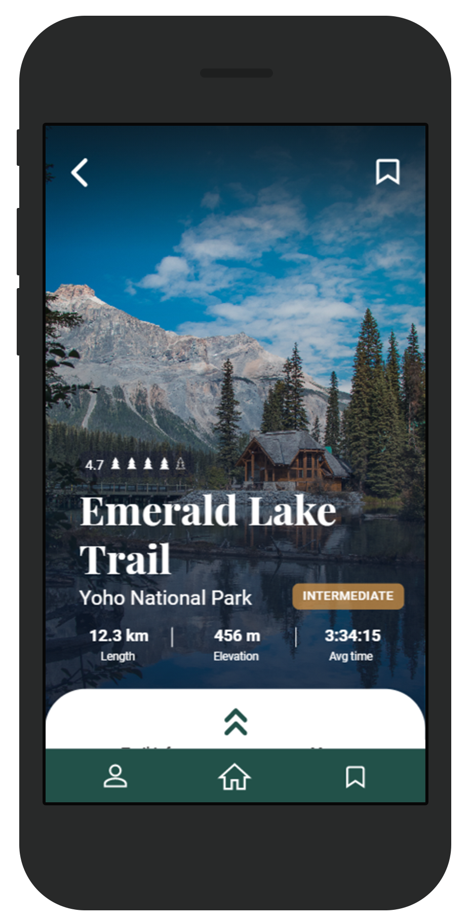
Addition of a trail difficulty marker to distinguish trail rating from trail difficulty
Addition of animated arrows to indicate swipeable card

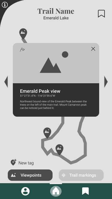
Addition of trailhead marker to help indicate to users where to find trail
Ability to scroll through viewpoints when selected
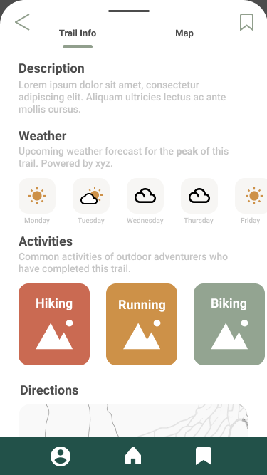
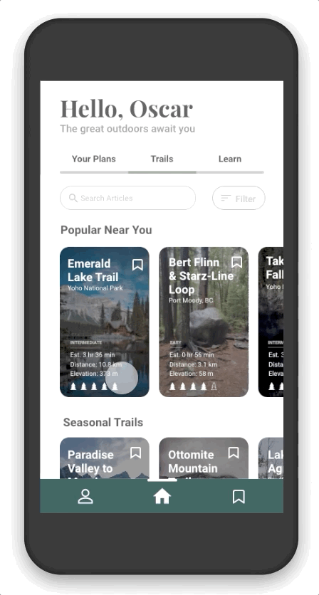
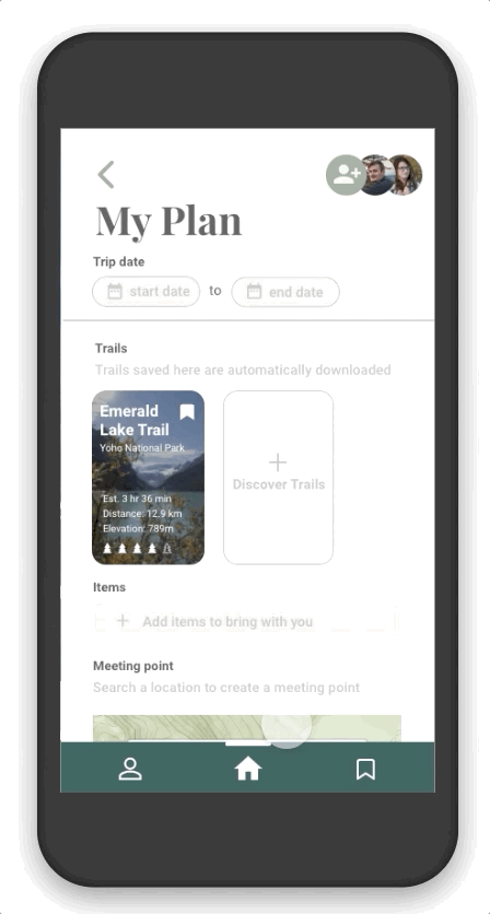
Final Design
For our final prototype design deliverable, we implemented any other minor usability fixes to ensure a smoother experience, in addition to smaller micro-interactions and animations to provide clearer interaction cues to all users.
Result
Overall, we were quite satisfied with the design and result of our final prototype. Although it iterated immensely throughout the process, we learned that it is vital to be able to go with the flow when considering both scope and navigating user feedback. After our last deliverable we developed a product webpage highlighting some of TrailMix's features, which I created using HTML, CSS, and Vanilla JS. We received an A overall on our final project, and shortly after this TrailMix was featured in the Fall 2020 SIAT Showcase and was presented at the 2021 Undergraduate Conference, during which we have been blown away with the positive response to our project.