project 05
cliq Keyboards
'Cliq' is an e-commerce website that was developed for a senior web design and development course, where we were tasked with creating an e-commerce site for a fully branded fictional business. This six week project involved user research, experience design, brand & styleguide development, interface & web design, and front end development for Cliq; an artisanal keyboard company selling keycaps, key switches, and keyboards, catering to novice members of the community looking to invest in their first customized mechanical keyboard.
Tools
Figma, HTML5, CSS3, SCSS, JavaScript, JQuery
My Role
Visual Design, Branding, Interface/Web Design, Web Development
Cliq live product webpage deliverable:
https://jasonxudrop.github.io/IAT-339-Ecommerce-Website/index.html
Scenario
Often keyboard buying experiences can be overwhelming for novice users, as sites typically have a large offering of products with little to no insight on how to know which keyboard is right for you, and no buying guide with handy keyboard information. We aimed to explore how we can make notoriously complex mechanical keyboards more accessible to beginner members of the keyboard and gaming community.
Ideation
One of the first things we did before creating 'Cliq' was establish that the domain we wanted to pursue involved selling cool, custom keyboards. Upon further research of similar brands and companies, we strived to design an artisinal keyboard company.
User Research
We narrowed our target audience to encompass novice keyboard users who are purchasing their first custom mechanical keyboard, or more intermediate users who are looking to upgrade and personalize their current keyboads with artisan keycaps and other accessories. We also developed two user personas to help guide our design and content decisions, and user scenarios.
Demographic
Tech savvy young adults
Novice and intermediate keyboard enthusiasts
Interested in or already own a mechanical keyboard
Common User Goals
Buy prebuilt keyboards with unique keycaps
Source parts from various sites to complete keyboard without soldering
Customize their mechanical keyboard without spending too much

Initial Sketches & Wires
From here we began doing some information architecture (as seen on our sitemap) to start organizing the content pages for our site. We generated various sketches for multiple versions of different pages, and began to narrow down a design direction to then base our wireframes off of.
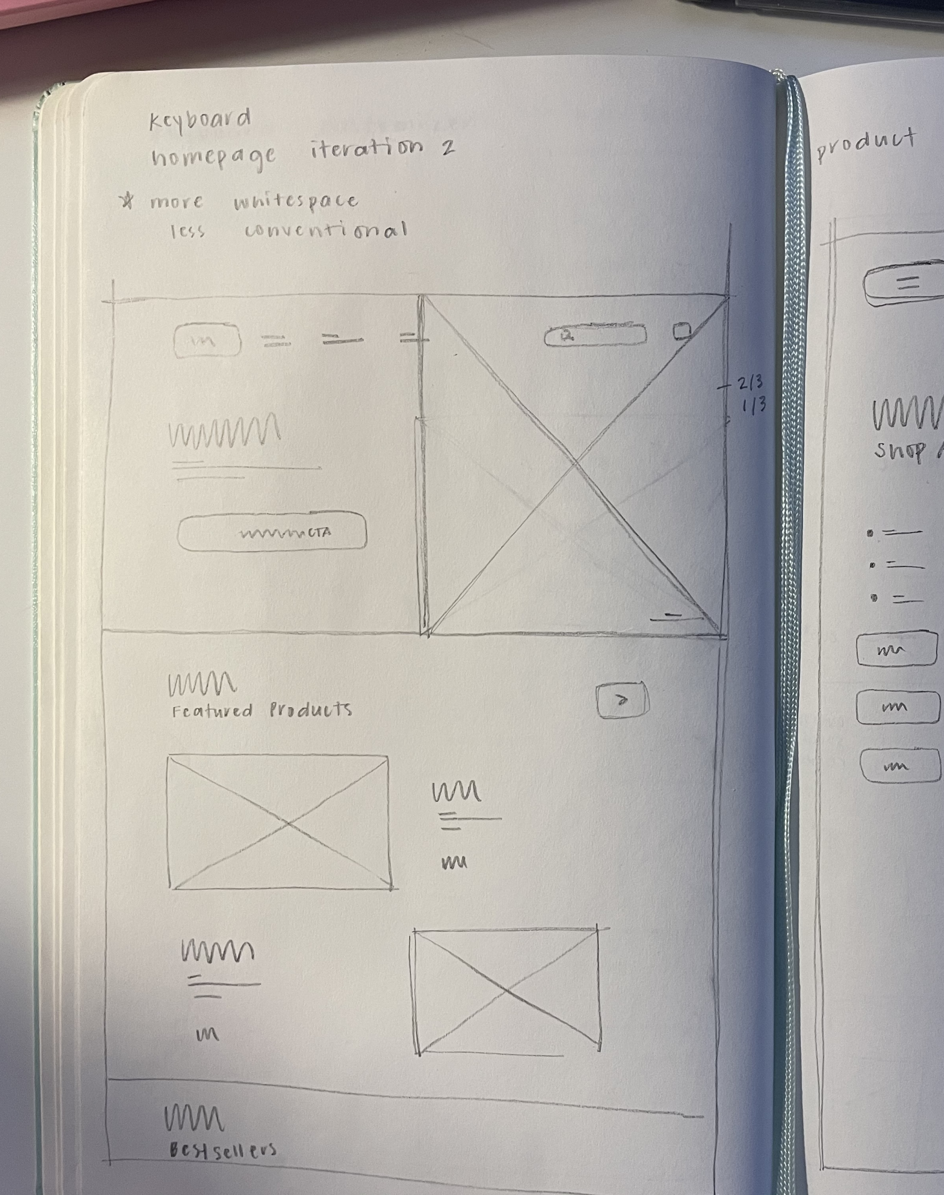
Early iteration homepage sketch
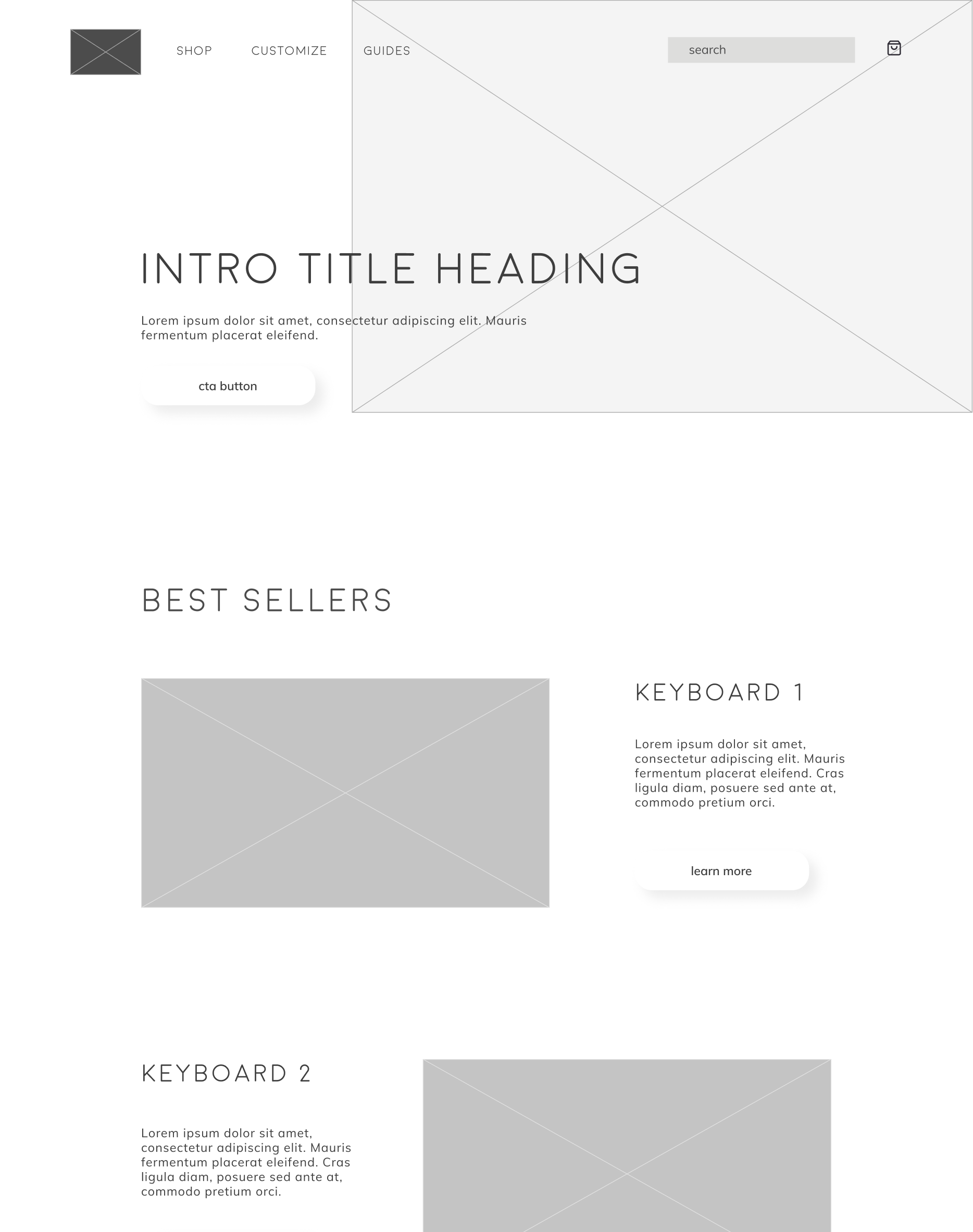
Homepage wireframe
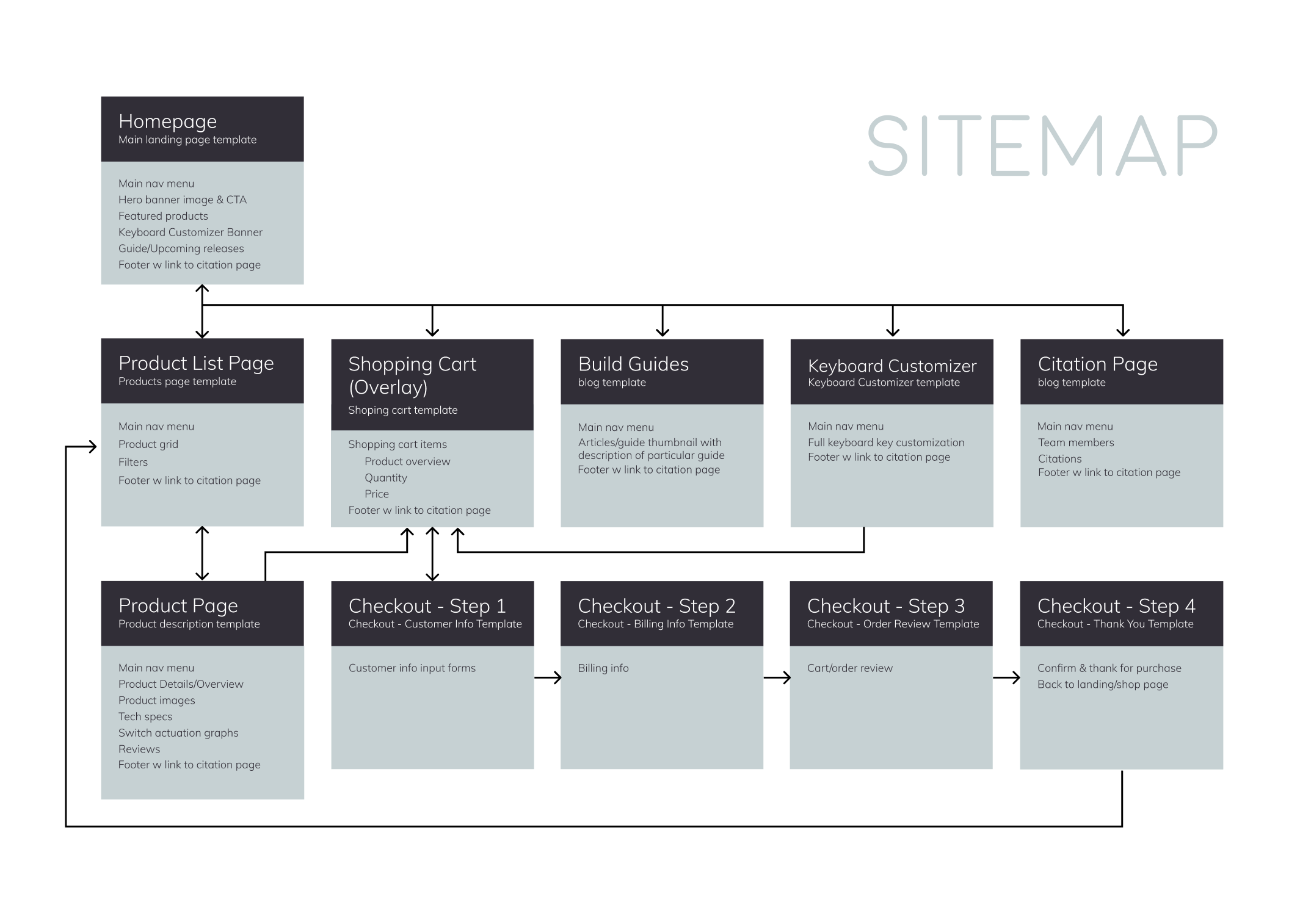
Final sitemap and page hierarchy
UI Components
Prior to developing the visual interfaces of our wireframes, we started building out different molecules and organism UI components (such as buttons, input fields, navigation menus, product cards, etc.) to begin the basis of our design system and pattern library. These components ensured consistency across all pages and helped us to get a sense of how we wanted to implement our branding and neumorphism throughout our website.
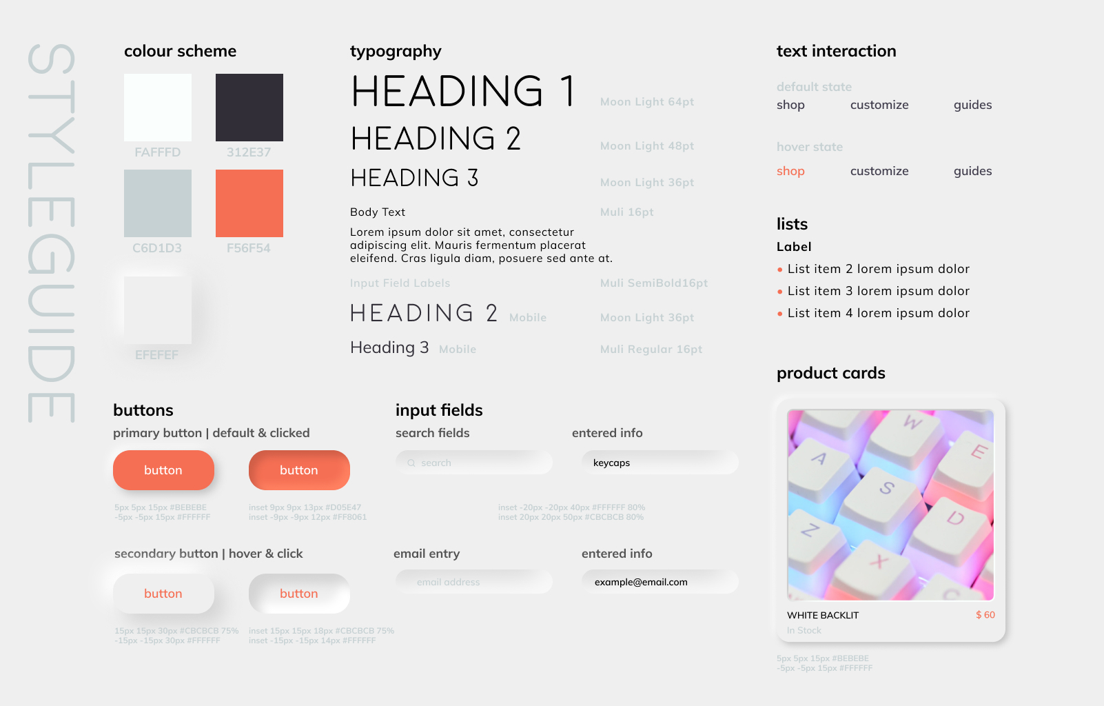
Pattern Library
With these UI elements and as part of the early stages of Cliq's development, each teammate had to develop their own version of the styleguide and pattern library site, which would later be incorporated into the live Cliq website where visitors and teammates could view use cases, code snippets, ui components, and styleguide elements. Below is my developed pattern library:
Visual Mockups
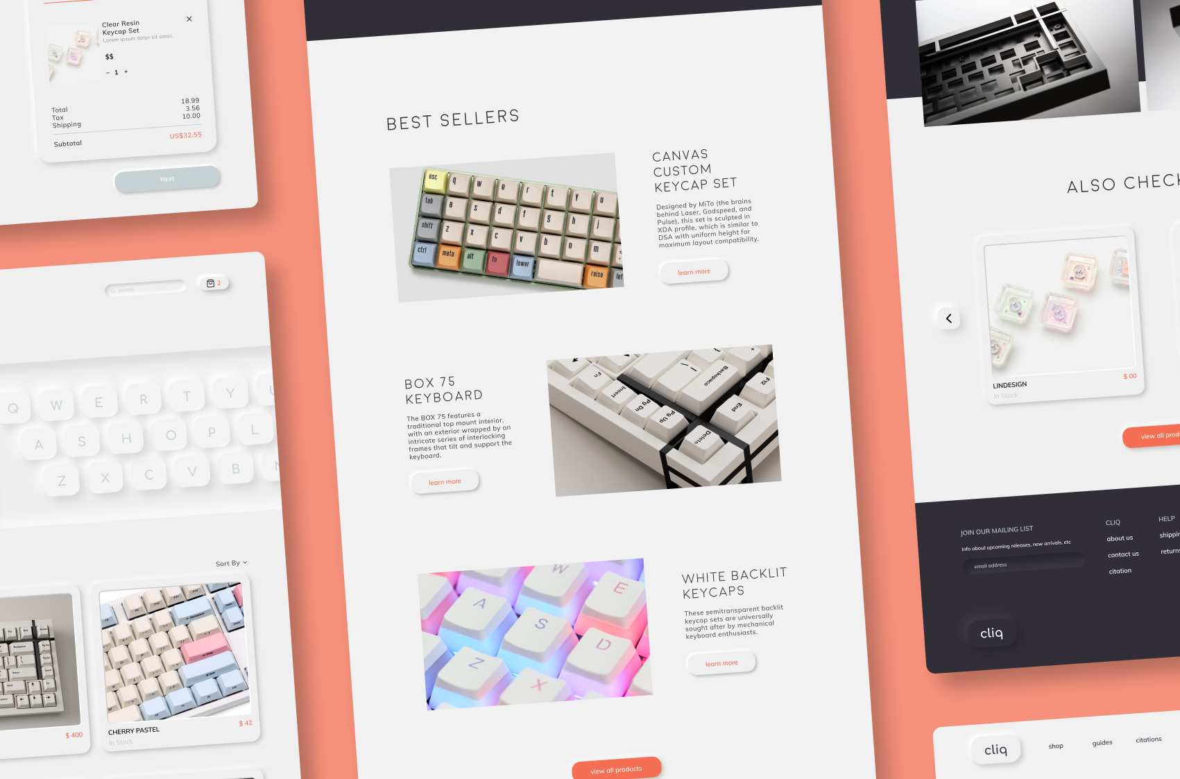
We then began building out our UI components simultaneously with our styleguide and pattern library, to create our full visual mockups and web interface. During this stage we also continued to push ourselves to use neumorphic design and determine the best ways to incorporate it in a web setting.
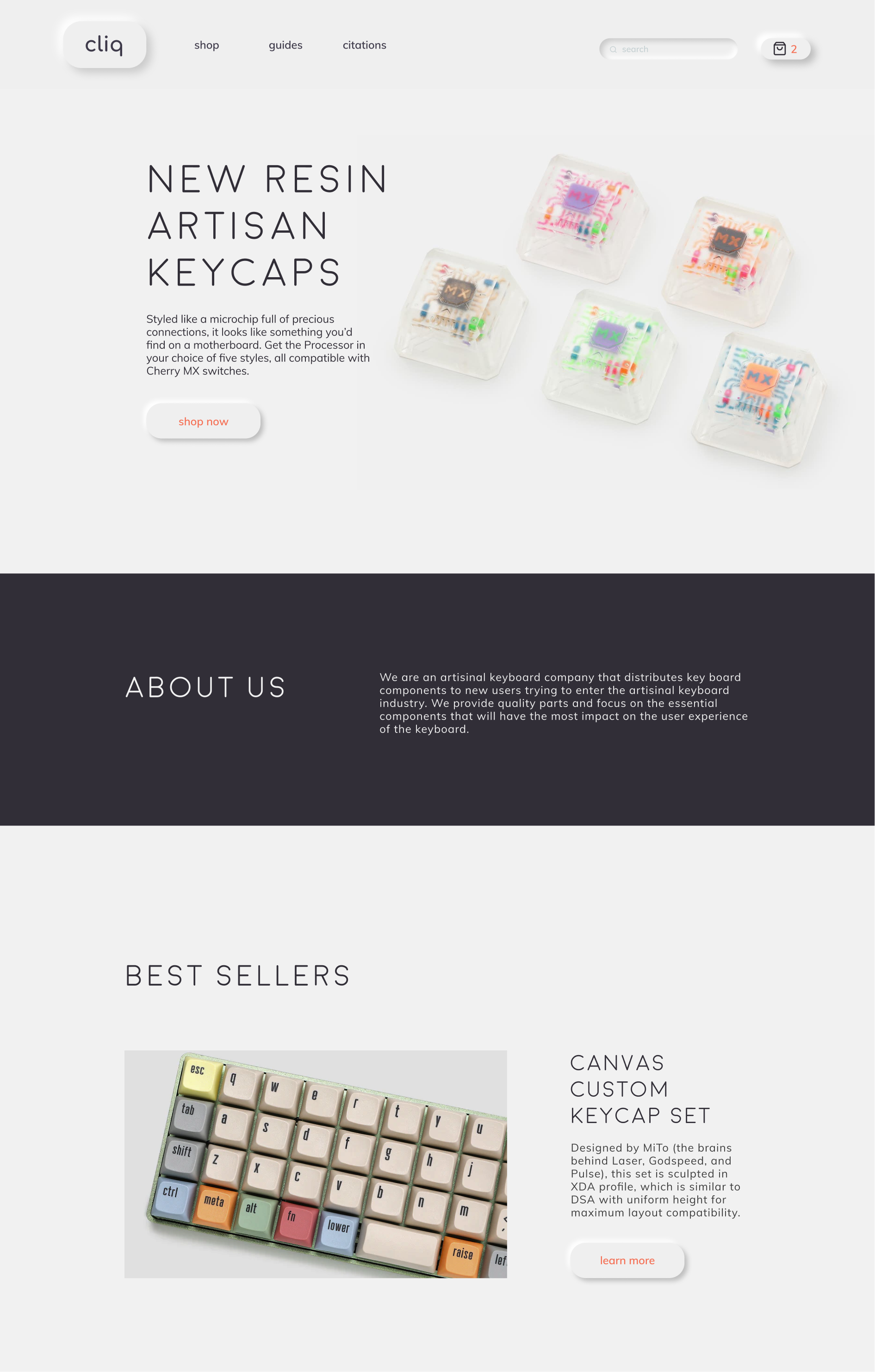
Hero section and top half of homepage
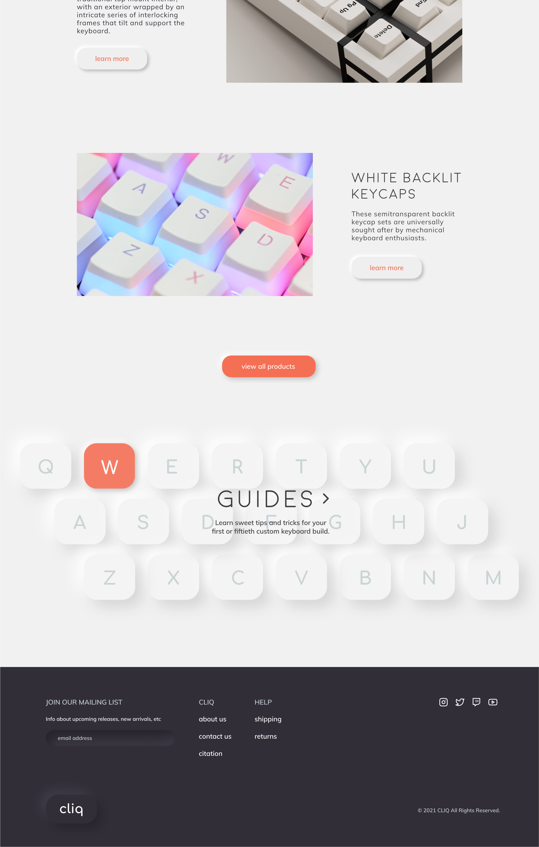
Best sellers and guides CTA bottom half of homepage
Development & Testing
During the early stages of development, we began testing the flexibility and overall usability of our site with classmates and peers. We conducted brief think aloud usability testing to ensure that users could seamlessly navigate our site and complete tasks, but also did this to gain additional feedback about any design issues. Our insight from this testing included:
Interaction
Guides section CTA on homepage was not a clear enough interaction cue
Lack of email submit button in footer
Design
Decrease hero image size on product detail page to allow users to gain insight into page
Lower opacity of guides section image on homepage to increase readability
Final Design & Development
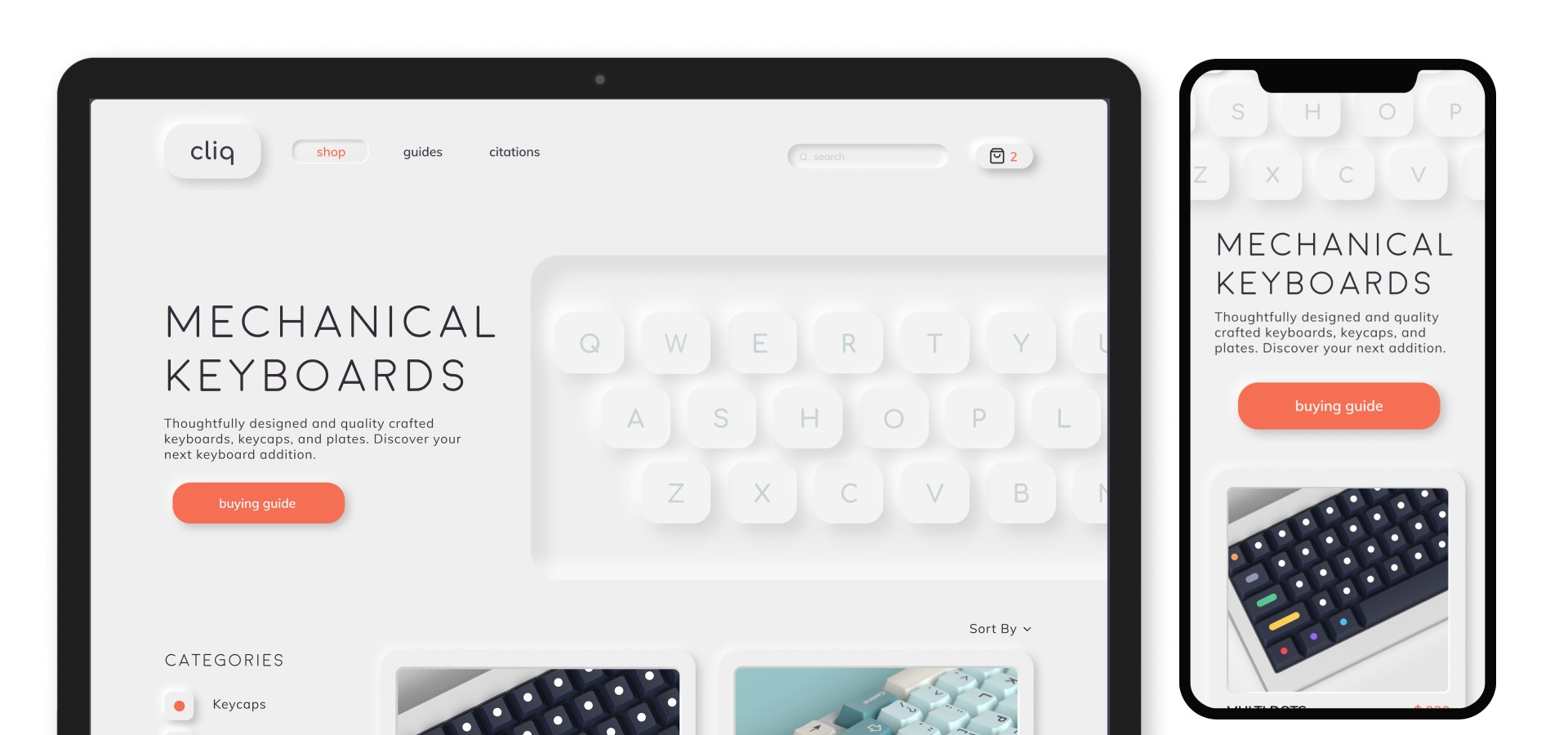
After testing and gaining feedback on the development of our site, we continued developing and implementing our final interface design, ensuring accessibility using relative units throughout the site, and prioritizing flexibility and responsiveness on every page.
Result
One of our biggest (but most fun) design challenges was pursuing neumorphism in a web context as a way to visually communicate the tactility and clickiness of keyboard keys. During the development of Cliq, we learned the importance of testing early and often, and strived to work on the responsiveness and flexibility of the site from the get-go rather than an afterthought. We are also happy to report that throughout development no one broke the GitHub repo :-)